The Challenge
Moving internationally is at an all time high and those numbers are only growing.
The resources to support those planning to move internationally have remained stagnant.
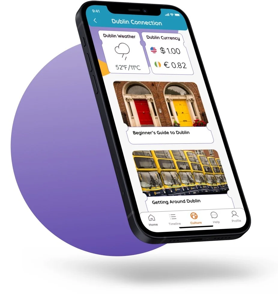
Global Home strives to take advantage of technology, specifically mobile apps, to reduce stress of users and bring focus to the great parts of moving to a new place. Now, all that is left is to figure out how.
Research and Discovery:
Does Global Home Have Legs?
I started doing secondary research to help support the viability of Global Home and back fundraising efforts with concrete data. Here was what I discovered:
Who Would Go the Distance?
Once I verified the need for Global Home, it was time to start determining who made up the target users. I created a survey and distributed it to social media groups focused on travel and moving internationally. Here were the breakdowns:
Other Insights:
Starting with a Google search implies users don’t know where to start (validated with user interviews)
Majority are young professionals with very small family units
2 main reasons for moving: professional and personal development
Walk Me Through It
Now that I had a better idea of who would be using Global Home, it was time see their concerns and pain points with the current international moving process.
From the pool of survey takers, I identified 5 participants that most matched the target audience and invited them for 1-on-1 interviews. This enabled me to gain better qualitative research and better identify where Global Home needed to focus on.
After the interviews were completed, I used affinity mapping to breakdown user feedback into patterns. Here were the common threads:
Where We Can Make the Biggest Impact?
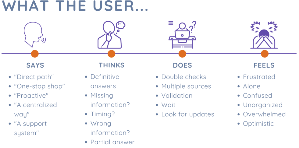
After talking to potential users it was clear that the time they need the most help was during the actual move. I then took all of that into account and created an empathy map to better understand what typical user would be the most concerned about during their move.
From this, I was able to establish a solid user persona to refer back to throughout the design process.
Analyzing Data to Make Design Decisions
After collecting and analyzing all of the data it was time to translate it into the foundation of the design.
Boiling down user feedback, it all came down to 3 key pillars that the app would stand on:
That lead to big questions:
How Might We streamline the international moving process?
How Might We give users the reassurance to focus on the exciting aspects of their move?
Ideation and Brainstorming:
The Backbones of the App
Once I knew the foundational elements and who I was designing for, it was time to start organizing how the app would work before I created the screens.
For that, I needed to better understand the functional needs of the app by creating some key user stories.
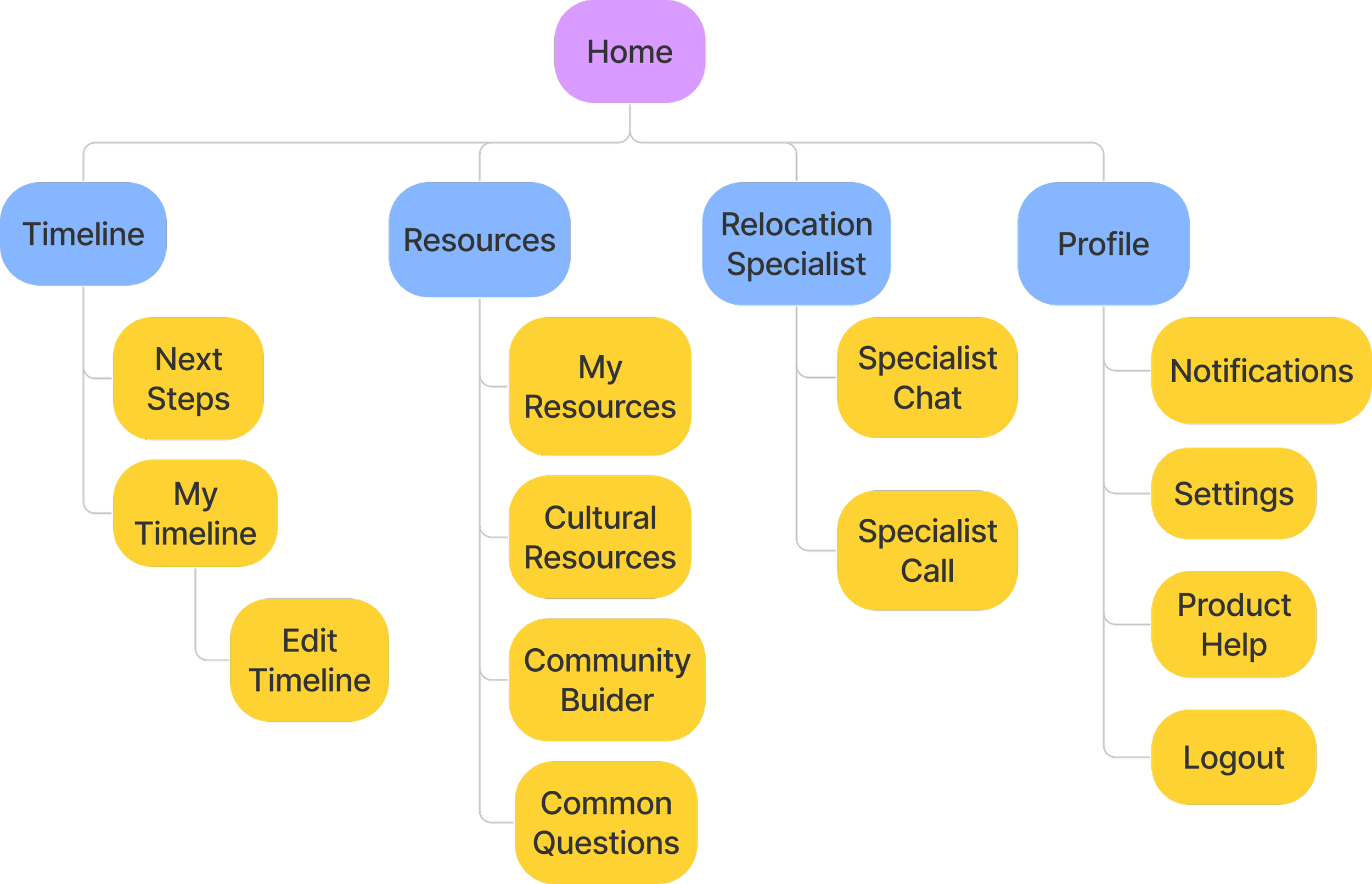
Having a strong understanding of what practical functions were needed helped me prioritize and organize the architecture of the app. From here, I went on to create the site map so I would have a better understanding of the key functions and how they interacted with each other.
This also helped stakeholders understand and prioritize user needs, so we could focus on the most important functions of the app.
Once I had the basic navigation in place, it was time to look at it from users’ perspective. My favorite tool for doing this quickly is user flows.
Design and Validation
Bringing the Designs to Life
Translating all of needs of the app into an actual, functional design took a lot of iterating and constantly bringing it back to users. The first deliverable I brought to users outside the team were some initial sketches.
I used the app POP by Marvel to create a rapid prototype out of the sketches and checked the usability through guerrilla testing.
The feedback from user testing was incorporated into the next phase of the design process: the wireframes.
Adding Personality to Reassure and Excite Users
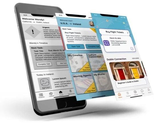
At the time, there had been no definitive branding created yet, so I used these to both test usability and gauge how users wanted to feel when using the app. I created a more hi-fidelity version to test various branding and features with on potential users.
User Insights:
Users preferred a card layout; it decreased user response time and prevented cognitive overload
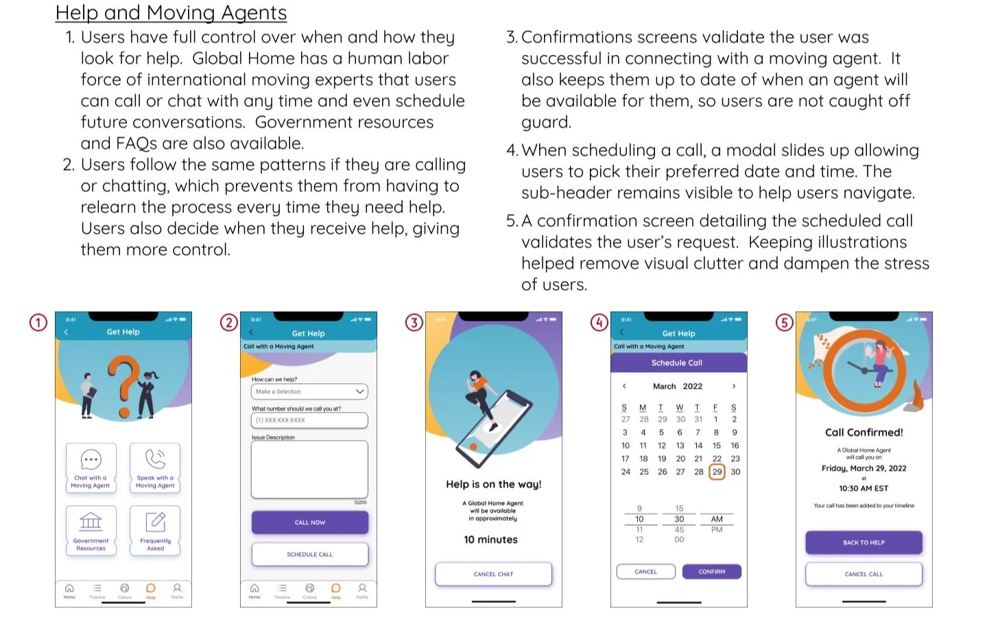
Added resources expanded the “Agents” into a full “Help” Menu, but gave users more options in finding answers
A layering effect was used for better navigation at the top of screens
The card layout was easier, but the excitement was missing from the process
While I continued user testing on the structure of the app, I also tested branding for the app as well. Here is the current style guide.
Bringing it All Together
Bringing users in for testing at every step allowed major changes to be made throughout the process, which helped avoid major redesigns. It was an essential part of creating an app from the ground up.
Having that feedback on both the style guide and the structure of the app gave stakeholders the confidence to invest in a full prototype. It also meant in the end I was able to narrow down design choices to meet user needs and answer the big questions.
Onboarding Process
User Log In Process
Are We There Yet?
The Designs Answer the Big Questions
How Might We streamline the international moving process?
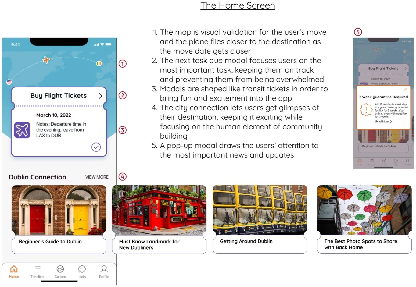
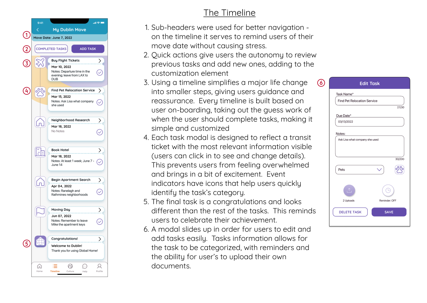
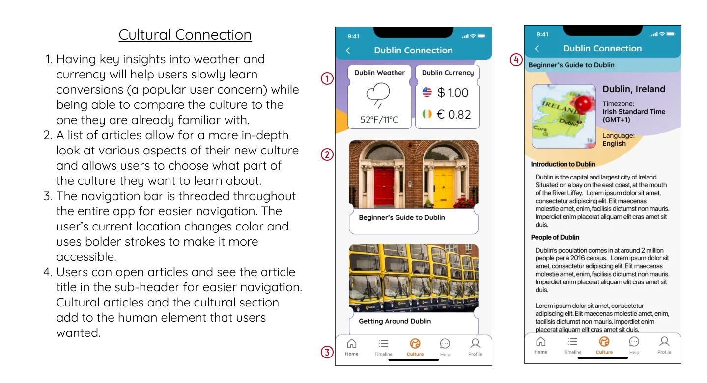
While we can’t change the actual process, we can change how users approach it. By creating a step-by-step process, tailored to the specific user’s circumstances, I was able to eliminate a lot of the friction felt by users. The timeline keeps users organized and on track. The help section guides users through uncertainty. The culture connection helps eliminate some of the concern over culture shock.
How Might We give users the reassurance to focus on the exciting aspects of their move?
By breaking the move into smaller, clearly defined, timeline tasks users have a clear understanding of what needs to be done and when it needs to be completed. There are multiple ways for users to double check information and review completed tasks.
I also made sure to include aspects that will excite users about their move. Users have the ability to explore the culture from the comfort of their couch. Design details, such as ticket shaped modals and the home page map, are meant to engage users in their move.
The Next Steps...
After 6 weeks of work, the foundational design for Global Home was complete.
The research done throughout the process made sure that I stayed on target and was able to focus down on what users really wanted and were willing to pay for in an international relocation app. It is a design that both reassures fears and inspires adventure.
The next adventure for Global Home’s design involves bringing to back to users and expanding beyond a native app.
Current metrics for success are being measured by analyzing task completion time, user satisfaction scores, conversion rate, and investor interest,
While Global Home is temporarily on hold, I know that it can grow into an amazing product and help people all over the world find a place to call home.
Thank you and happy travels!


